Creating an Outline Hover Animation
Add a bit more life to your web page.

I am a full-time Web Developer with a background in Music Education. I am self-taught and specialize in JavaScript and C#.
CSS is a wonderful tool on its own that can create some great effects when you are building custom websites and landing pages. In today's post we will focus exclusively on creating an outline effect hover animation that can be used on container cards. Don't worry, you can use it in other locations, but for today we are simply using a card for the example.
If you would rather code along than read then click the link below to go through the process with me.
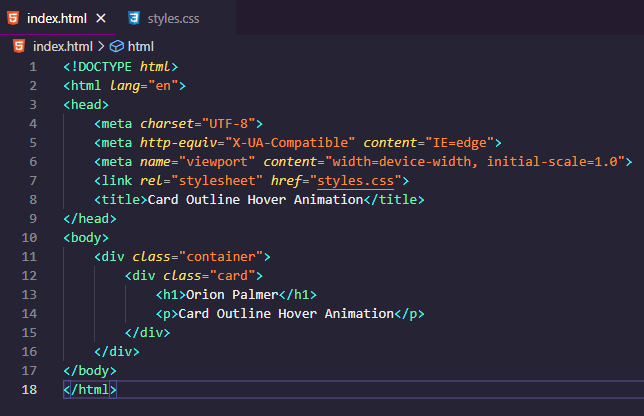
Step 1: HTML
The first step we have to do is establish our HTML which should be rather simple. In our case we only need to create two classes. First the container class and followed by the card class. Within the div for the card you can include whatever information you want. In my example I went with an 'h1' and a 'p'.
Step 2: Basic CSS
At this point we should begin creating our CSS document. To create our basic structure for this example I did the following.
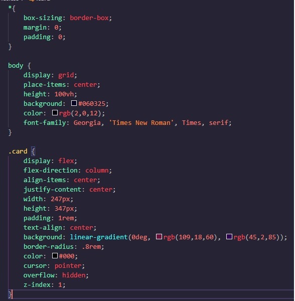
You can customize it however you want in this section as this is all based on preference.
If you want your .container display to be flex rather than a grid, you can do that as well.
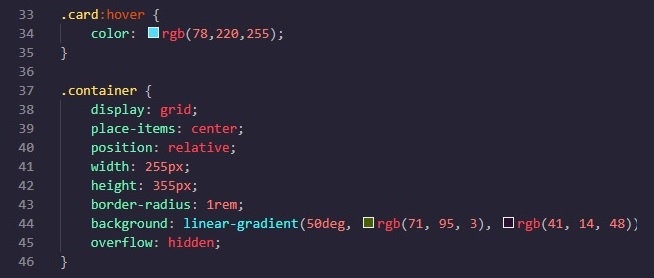
Step 3: Adding Animations
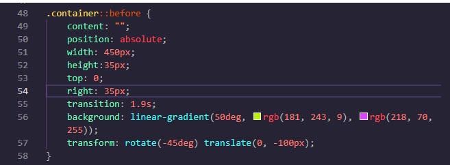
To create the animation we need to establish a before section to our container. The purpose of this section is essentially create the color or our animation and indicate its starting position and additional attributed. that will be displayed upon hovering over the item.
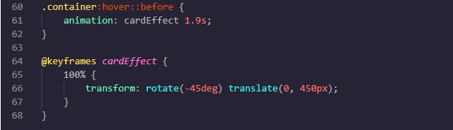
Afterwards, we need to indicated the animation itself which must be separated into ".container:hover::before" as we will have to create a trigger for the animation to initiate.
Lastly, the trigger has to be given a its 'function' so to speak.
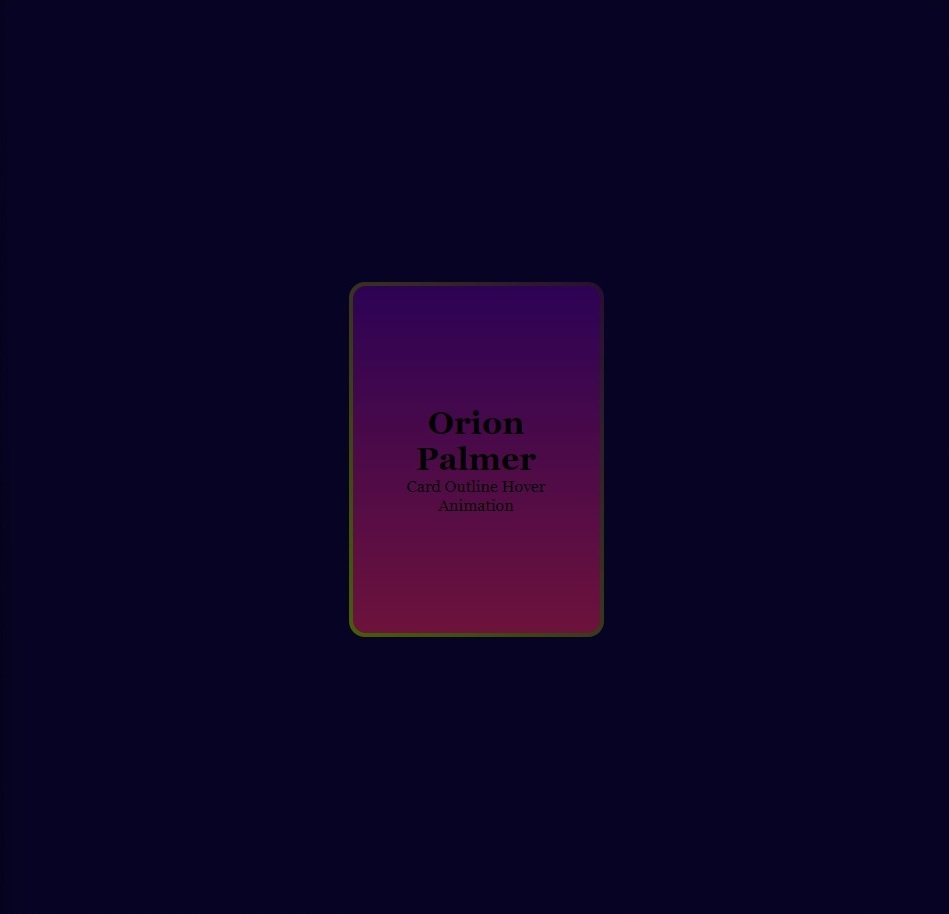
Once in effect you will get the final, quite beautiful result (especially if you are a fan of neon).
Written by: Orion Palmer


